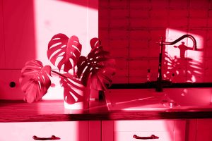
 The reckoning has come: 2023’s Pantone Color of the Year is Viva Magenta! After the neutral green and periwinkle of past years, Viva Magenta offers an opportunity to go bold with your expression. It might remind you of velvet curtains, ripe fruit, or red wines. Depending on the shade, this color runs the gamut from cute and rosy to oozing with after-dark class. No matter what you do with, it will catch eyes and inject a memorable personality into your home.
The Balsitis Contracting team offers ideas on how to use this bold, transgressive color with your interior.
It’s All About Contrast
When you read bright blue text on a bright red background, doesn’t it make your eyes hurt? When you look at a washed-out photo, don’t all the details tend to blend together? Contrast is the foundational principle of color theory, and it’s the best thing to keep in mind when selecting your color palette. Colors can look completely different depending on what’s next to them, so much so it can create optical illusions.
That’s why Viva Magenta is great, but it’s not designed to stand on its own. You need neutral or low-saturation, opposite colors around it to draw the eye and make it “pop.” Lighter, low-saturation shades of Viva Magenta can support other colors, too – for best results, the rule of thumb is to go across the color wheel.
The Power of Adjacency
When you’re designing your space, it pays to focus on the big picture before the details. This is especially true for Viva Magenta, a warm color that really likes to take center stage in a composition. Try considering your colors from room to room: a hallway with some yellow, orange, and red could lead well into a magenta-walled bedroom.
Factor in the content you’ll have in the rooms as well, beyond just the painted surfaces. Viva Magenta makes a great contrast to leafy greens, so if you’re planning on using potted plants in a particular place, it can play off those spectacularly.
Sometimes, more of your bold colors can reduce contrast, too. That might sound a bit oxymoronic, but it makes sense when you think about objects and surfaces next to each other. If you plan on having a bold color cover a wall or two, homogenizing the colors around and against it can help it blend into a backdrop.
Feeling inspired? Balsitis is happy to help you find the perfect color statement for your home. Contact Balsitis Contracting at 262-203-3952, e-mail info@balsitiscontracting.com, or complete our online form.